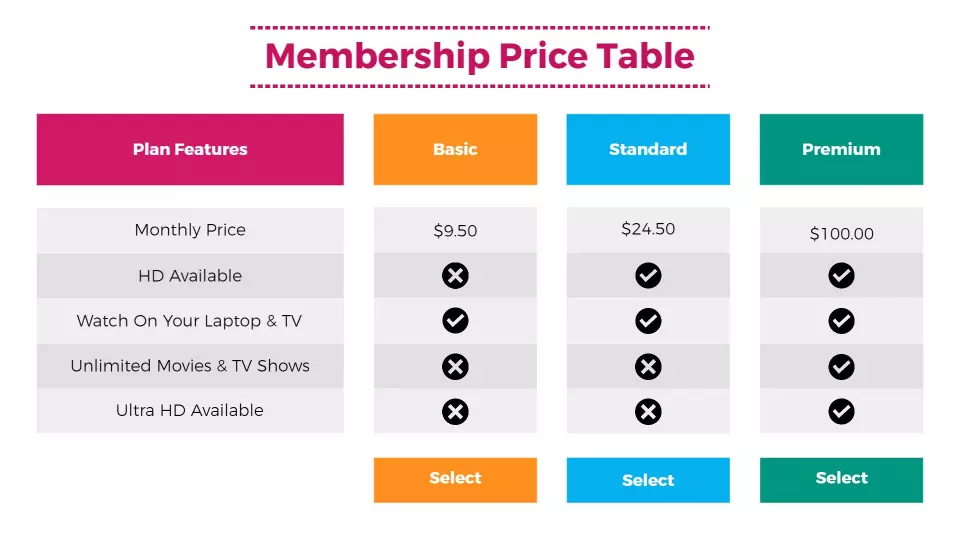
A “beautiful to look at” table is not only marketing but helps to make yourself understood why the recipient is encouraged to analyze the data and does so with greater interest and faster and therefore more emotionally involved. So in the end, the data represented remain more impressed in the memory and for a longer time.
After all, publishing art was born precisely for these reasons.
Are there any simple rules to follow?
Yes. There are and some are simple others are rather “abstruse” and borders on mania.
We can organize a training for the basic rules, and this can be done in a couple of webinars (or one to one online training) of 30 minutes each.
The more complicated rules, on the other hand, are to be applied “on field” and then explain what has been done and the reason by comparing the different methods. So, the most effective thing is to organize training on the job.
What are the basic principles for working on tables?
A first phase concerns the intervention on Excel to define the format, the position, the organization of the headers and footers and the additional columns to “lead” the recipient in an intuitive way to interpret the data presentation logic.
This activity is not trivial because sometimes graphics and above all the sequence of tables must be added for the construction of a path in order to demonstrate the thesis that prompted the author to represent the data in a tabular and graphical way in one way rather than in another one.
The second phase is about editorial transformation, I would call it table layout because that’s the correct term. for example:
- how much space should the table take up;
- Portrait or landscape;
- How should a large table be divided;
- font size, font, accuracy, alignment;
- how to write the header and footer notes of each table;
- how big should be the correctness of each column;
- how the alignment of the data within the column;
- how much space will make each column and between groups of columns;
- how to differentiate the columns from each other to create a detachment that helps create a mental “pause” before entering a new type of information;
- the font type to use for heading, footing, footnotes and columns that have data only and those that have alphanumeric content;
- when and where to put shims called Thin space, En space, Em space.
What methods can we adopt?
The layout techniques are different:
from the intuitive type which naturally is not always effective.
then there is a graph that is very valid when there are few tables.
Then there are algorithms that can be applied via macros to “mathematically” determine all the parameters in a precise way to be applied in the production of tabular pages using programming languages.
We have developed programs that allow you to apply these algorithms that find the break-even by overcoming a hundred tables.
How can I know the principles on which these “graphical” methods and these “mathematical” methods are based?
This requires online training which we strongly recommend when the client needs to create documentation that has a significant marketing effect to which an important commercial objective is linked.
Last Updated on June 5, 2024

